Going back to school
It’s been a few weeks since I finished the Sucker Punch diorama; so I’ve had some time for the thing to marinate. I asked my friend Jason, who’s an artist by profession and went to school for such what he thought about the diorama. We started building gunpla together when we were young, so there is familiarity with the material. I had gotten a few comments, some rather long and intense about the posing in the diorama. And having recently finished it; I wasn’t really in a position to defend or analyse it at that time. And I also believe that pride has a great deal to do with this as well. It is very difficult to take criticism on a piece of work one makes. We tend to go on the defensive more often than open up our minds to view things from other perspectives. This is all fine and well if you’re building for yourself and no one ever sees your work. But once you post it up publically, or enter competitions; then things change. You’re putting your work out there to be judged – regardless of if you asked for it or not. And when I first posted the work online, I completely dismissed the comments that criticized the work.
Now that a decent amount of time has passed, I believe I am ready and can objectively revisit the work. So the question I asked Jason is what he thought about the pose – Zogok punching Cold Climate GM. On a personal level, it didn’t really sit well with me either; but I was having trouble formulating what was wrong. I tried a few things suggested online but nothing clicked. I needed to go back to school. I didn’t know what was bothering me about the kit the more I looked at it.
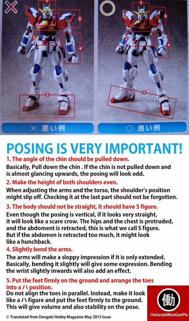
The above is the result of our discussions that night. It wasn’t all about posing; but about diorama photography as well, which I will discuss further down in this post. But back to the posing. A few weeks ago, this picture was posted on the social media sites:
One of the big things that sets gunpla apart from your other plastic models is the joint systems and the freedom to pose the kits. From the above picture, it is clear that posing is very important when it comes to presenting the built kit; especially at a competition. Granted, most plastic model competitions do not award points or even account for kit positioning; for the judges, I believe that it does factor in subconsciously. Taken the same kit, built with the same skills and quality; one is not posed just standing straight; while the other is dynamically posed; the dynamically posed kit will be more aesthetically pleasing. And because of this, there is a subconscious bias to the posed kit – even though they are built to the same specs; the one that looks more pleasing to the mind will have the edge.
That said, I believe that the focus of the diorama, where all the action and movement in the diorama – the actual punch; failed miserably. What I wanted to do is to capture the moment the GM gets punched by the Zogok. Jason and I discussed this, and he used an example about MMA fighting, slowing a punch down, frame by frame, the majority of the frames are going to have very little changes at the moment of impact. The moment of impact will be static. And capturing that exact moment was the mistake. I should have captured the moment several frames after the initial impact. It should have been the reaction, the result after the punch.
So we ended up with the following:
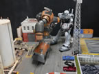
Knees were bent, the GM’s body is twisted, the legs are kicked up, the arms ar up in reaction, the head is tilted down in reaction. The Zogok has a bend in left knee and the right leg is swept back slightly to capture a punch stance. The fist is turned and the right arm with the knife is raised to the ready of the second attack after the initial punch. If I were to do a stop motion capture of the action; my original pose would be the start of the action – the slow build up; then the current pose will be the actual climax; which will lead to the end of the action.
I never broke down my dioramas from the perspective of a video. And because I’m trying to show action in the diorama; I really need to think of things happening as if it was a frame cut from a video. That’s where my problem was; I just put the objects in and created a picture, a static picture. And as a result, there is no motion and the diorama is nonexistent.
Jason told me that things need to be exaggerated. The eyes see the still diorama, and the mind adds in the motion. So to best trick the mind, we need to exaggerate the pose to incorporate as much action as possible; so the mind has a much easier time to fill in the blanks. The initial pose was pretty exaggerated, and I toned it down slightly. Personal preference; but I think this pose now has much better motion and works better for the entire diorama.
Diorama Photography
So now that the pose was done, I needed to take new pictures of the dio; and that’s where the next discussion started. 99% of all my pictures have been done with three lights pointed at the subject and sometimes diffused with some white tracing paper to soften the lighting. So I started with what I know and how I normally photograph my projects; and as an example, the previous set of pictures for this project was done with full lights. And because of the rather bright lighting; the base lighting effects are diminished. I started turning off the lights one by one.
Although I didn’t specifically design a time of day for the diorama; most folks have mentally placed it at night or possibly early morning. And since I already have brightly lit pictures, Jason suggested that I turn off the lights. Shadows and using the base and mono eye lights creates an effect for the audience that further pulls them into the scene. Things are difficult to see because of lighting is more realistic; and that’s how things really appear in low light settings. The audience’s eyes strain and they are forced to look closer at the diorama immersing them in the work’s story.
As a modeler, I want to show off all the cool things I put into the work. But from the artist’s perspective, there are things lost when too much light floods everything. Sure you can see everything, but it’s not as immersive with shadows, the dark atmosphere, the subtle reflection of lights from the mono eyes and the tower lights.
We then turned off all the lights in the room, not just the three standard lights I use; which created the following photos with much more contrast between light and dark.
The next exercise was to use a flashlight to spot specific areas to create different highlighting effects.
I definitely learned some new tricks for snapping pictures especially for a diorama. Other than the major repositioning of the cold climate GM, subtle changes to the Zogok makes a world of difference. Still, this will not please everyone, but I think this is a vast improvement over the previously posted images for the project.
And as previously promised, I snapped a quick video that shows the diorama switched on via the bluetooth controls and the morse code conversation between the Zogok and Zee Zulu.



“The moment of impact will be static. And capturing that exact moment was the mistake. I should have captured the moment several frames after the initial impact. It should have been the reaction, the result after the punch.”
Told ya so, dude. :)
Anyway, I think it’s a substantial improvement, and the diorama looks especially great illuminated by its own light sources.
yeah, yeah yeah.. I know… I eventually listened. It just difficult to wade through the wall of text! :D But you were right… tell your sister… you were right…
Heh, yeah, “wall of text” is never too good for clarity. Bad habit of mine.
I been thinking about what was said about posing and perhaps studying the dynamic poses in comic books could teach us something about posing our models.