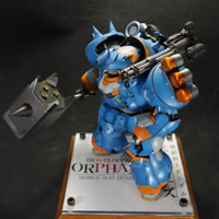
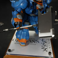
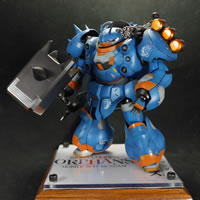
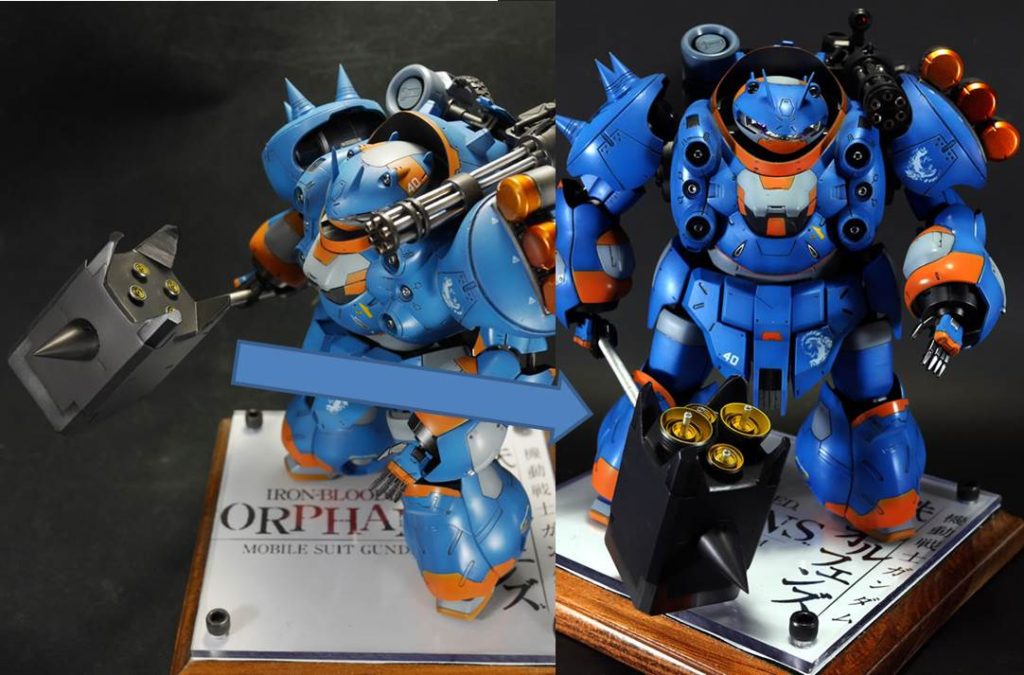
I’m revisiting this project as I plan on taking this sucker to Otakon. When I was working on the project, I haphazardly added some tiny little thrusters to the end of the hammer. Even at the time, it didn’t quite look right to me, but it didn’t really hit me until I was working on the Hi Nu project. Below are pictures I originally took of the Gusion with the hammer and tiny thrusters. You cannot even see them at certain angles.
This was sort of bothering me when I finished the kit, but I didn’t quite know what was really bothering me. Not until I was working on the Hi Nu project did it come slamming into my brain. There was just too much negative space at the back of the hammer with the little thrusters and they just look completely out of place. I had just replaced some crappy resin thrusters that had come with the kit with some updated resin thrusters that I had casted from molds of new aluminum thrusters I picked up specifically for the Hi Nu project. So the idea was to place bigger thrusters at the back of the hammer.
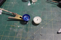
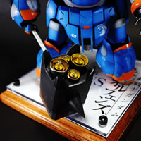
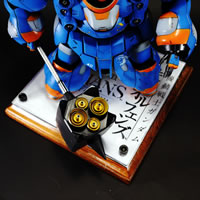
Since the aluminum thrusters had multiple parts, I just made casts of the separate pieces and used them to create different sized thrusters. I ripped up the original smaller thrusters and planned out a new layout with the new much larger thrusters. Once the plan looked good, I made more copies, cleaned them, primed them, then painted them. Then I glued them into place. Here’s a picture with the difference.
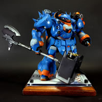
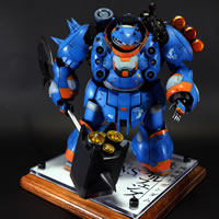
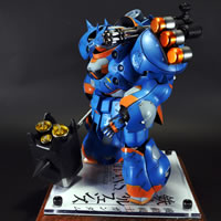
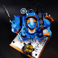
I think this is a definite improvement over the wimpy little thrusters. They are beefier and there’s much less negative space at the back of the hammer. Here are some more pictures.
|
|
|
|
|
|
You can always go back to fix things. And no, I’m not fixing the bloody decals :)
